arrow_back View all case studies
Case study
Customer support website
Designed, tested and delivered a customer support website for a suite of native apps
📖 Background
This project was carried out a publishing company that produced digital magazines, which were readable through dedicated iOS and Android apps. There were a number of bugs being worked on by the development team and it was taking a while to resolve them. In response, the company felt that a support website would help as a stop-gap for customers to resolve problems themselves while the development team worked to improve the apps.
⚠️ Problem
Customers were contacting support trying to resolve issues that could easily be resolved in the app. Support was handled by a third-party company who would often take several days to respond, exacerbating the problem. Customers were left feeling frustrated and the business was being billed for every support request.
🎯 Goal
Reduce the number of support tickets raised.
🤔 What did we do?
The key stakeholder involved in this project opted for a common solution to this problem in a bid to not reinvent the wheel; provide a support website containing instructional articles that customers could use to solve common issues.
👨🏻💻 Competitor analysis
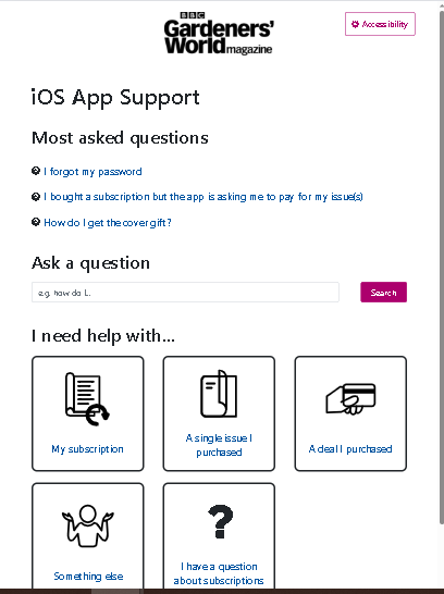
We looked at a number of other support systems to understand typical functionality and sketched out howwe would like our site to be arranged. These included components like most viewed articles, browse by category and a search feature.
🎨 Prototype
Using the sketches I made a mid-fidelity prototype as a Jekyll static site. This took a few days to build, which is longer than it would typically take to produce a prototype in Figma, but it gave us a chance to experiment with some interactive elements and the search feature.
🔎︎ Usability testing
We then carried out some usability testing to capture any glaring problems we hadn’t spotted. Every participant was a member of staff who had no affiliation to the team or product.
What we learnt was fascinating. There were some really key parts of the user flow we’d designed that people didn’t see, primarily the list of most viewed articles, which had the answer to the problem we’d set users during testing.
One user who had a diagnosis of dyslexia explained that they dismissed the links because it was difficult to distinguish between them. They just saw a blob of blue colour and moved on down the page. We’d take out the bullets at the beginning of each list item, believing this could bring the beginning of the sentance closer to the left hand edge and making it quicker to parse. But we’d accidentally made the links more difficult to read! Simply putting the bullets back in made this section significantly better for usability.
💅🏻 Refinements
We made changes to the prototype on the back of usability testing and ended up using it as the finished product. People made comments during testing like “it looks functional, but it needs to be”. Emphasising that this product was about the customer finding the right information quickly, not entertaining them.
We added the ability to brand the site based on which digital magazine app you’d come from. The magazine logo would appear at the top and buttons, etc. would all use branded colours. Information about the device and app version, etc. would also be passed through to the raise a ticket form to save time going back and forth with support.
🏁 Conclusion
In 3 months we’d designed, usability tested and built a fully working support website, with some very handy features that would hopefully help customers to resolve problems themselves and provide a smooth journey when they needed further help.
The aim was to reduce the number of support tickets created and strangely the number of tickets didn’t significantly reduce. I later learnt that our customers chose to speak to someone when seeking help, rather than make the effort to find the information themselves because of the perceived effort. Having someone simply tell them which buttons to press felt like a much friendlier and effective way to resolve a problem.
This likely isn’t the case for every audience and if I were to do this project again I would have opted to speak to customers about their experiences with support before diving in with a common approach.