arrow_back View all case studies
Case study
Multi-column admin interface
Designing and usability testing a prototype admin interface.
📖 Background
In this project I created and usability tested a prototype content component for power-users of a publishing company’s in-house Content Management System (CMS).
Prior to this part of the project we’d carried out some visual preference testing for a digital magazine app and discovered that displaying content in multiple columns was viewed favourably by subscribers.
It gave people a break from reading content in a single column and made the layout more visually interesting. One user described it as being “a bit like a game” because you could choose which column you’d like to read first.
To make it possible to arrange content in columns, the content team needed an interface within the CMS.
🎨 Prototype
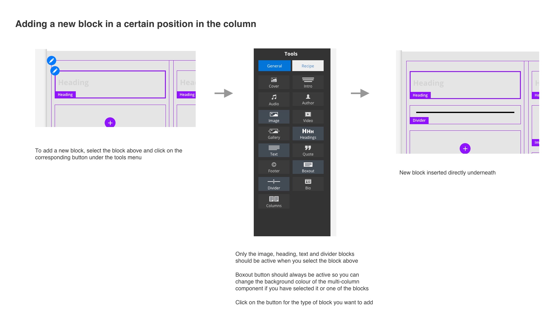
The application already had components to enter headings, text, images, etc. so I intended to create a multi-column component which would present these existing components in columns.
As this was intended for power-users, I opted to make the new interface familiar to them; using interaction styles that were consistent with other components already in the admin interface.
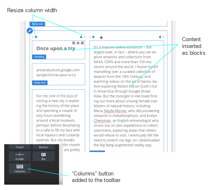
Columns aligned to a 12-column grid and I wanted the user to be able to choose how many columns were displayed and how wide each column was, so you could create some really interesting and engaging layouts.
I’d designed buttons to let you resize each column, remove columns and add new columns.
I produced a testable prototype using VueJS in 2 days, which was fully interactive in the browser. I had a dev version of the CMS running locally on my laptop (with some help from one of the developers) and with a bit of tinkering got it working with real content.
🔎︎ Usability testing
To usability test the prototype, I shadowed a member of the content team. Their job was to turn articles from the print version of magazines (PDFs) into digital magazine articles (HTML), using the CMS. Their process was to start with a crude import of each article from a magazine issue and make formatting improvements, using the PDF version to guide them. When each article was ready the issue could be published.
So I setup a crude import of one article and asked them to get it ready to be published, with the only criteria that one particular section of the article was arranged in 3 columns to match the print layout.
The user was able to format the article, but there were a number of problems with the multi-column component.
🐌 Getting content into a column was slow
The user had to drag and drop content from above or below the component to add it to one of the columns. Scrolling up and down, moving each bit of content at a time was a slow, fiddly process and it took a long time for users to get all of the content into the component.
⏳ Adding a column was time-consuming
To add a column, there needed to be enough space to begin with, meaning you had to reduce the existing column widths before adding the new one. This wasn’t obvious and the user wondered why they weren’t able to add the column until they figured it out.
Once the new column was added, resizing each column to make them all equal width was fiddly and time-consuming as you had to click on an arrow to button attached to each column. As the column resized by 1 column, the button moved with it, which meant the user had to make an effort to move the mouse a lot when resizing.
👆 Resizing columns - drag, don’t click
Users tried to click and drag the arrow buttons to resize columns, as they believed this is what the icons were indicating. It became clear that dragging columns to fit felt like a more natural method of resizing than clicking buttons. It was also faster, as the user would be able to resize by multiple columns at a time.
🍿 Popcorn session
I wanted the key stakeholder and the developers to see what happened in testing, so in a popcorn session we watched a screen recording showing the user struggle with the component.
At the beginning of the session the key stakeholder stated they thought the component would have already been built by now. By the end, they realised why it hadn’t and understood the need to continue to work on it until it was usable.
🛹 Skateboard version
As many of the difficulties were with resizing, adding and removing columns, we decided to simplify the component for the first release, to get something delivered promptly while we figured out the more complex functionality.
This skateboard version included:
- 2 columns of equal width
- No option to add/remove columns
- No ability to resize or re-order columns
- creating new heading, text and image components within columns so content could be copied and pasted instead of slowly dragging and dropping
I tested the skateboard version with the same member of the content team and it was a significant improvement over the first version. Some stakeholders had also joined the testing, as the project had piqued their interest following the popcorn session.
Only minor tweaks were needed to the prototype and the component was deemed suitable for development.
🤝🏻 Handover
To handover to the developers, I produced a design document which demonstrated how the component behaved when the user performed certain actions.
I went through each action with the developers using the prototype, so they could see it in person as well as refer to the design document.
I followed this up by writing JIRA tickets, including detailed acceptance criteria. The developers commented that this was really well documented and set clear expectations for how it should work.
📣 Post-deployment feedback
The component was live and working as designed. A member of the content team made the following comment in a meeting shortly after using it:
“I used the new multi-column component and it was super easy”
🏁 Conclusion
I was so glad to hear positive feedback at the end of this project, as my intention had been to make the component feel familiar and speedy. Had we simply delivered the first version I designed we wouldn’t have had this outcome.
I enjoyed shadowing as I got to sit with the user and understand how the work I was doing directly impacted their day and I had the power to make their working life better through my observations.
Another great outcome from this project was the enthusiasm from the key stakeholder and the rest of the team along the way. There wasn’t much interest until people saw the performance of the testable prototype. Realising the problems for themselves and being part of the decision-making for the improved version gave the team a sense of ownership over the outcome and they felt invested enough to be a part of the testing itself.