arrow_back View all case studies
Case study
TechRadar.com review template
Discovery research to define an improved product review template
📖 Background
The business chose to re-platform all of its premium sites so that each site could be maintained much more effectively through a single platform. In turn, this meant that the business could share the same infrastructure across the sites and reduce running costs.
Previously, each of the sites were built using unique layouts, so the business needed to produce standardised layouts that could be used for all sites. For example, a review of a smartphone on TechRadar and a review of a coffee machine on T3 would both need to use the same review template.
🎯 Goal
Produce a responsive review template for product reviews, which can be used for multiple types of product.
📝 Approach
No previous insights existed about user needs within the business, other than secondary information found online. Previously the business had assumptions and speculation which led their decision making.
With so many sites offering product reviews which included so much information about products, I needed to optimise the information we displayed so we only included information that was useful/relevant to users. I also needed to understand which bits of product information should be shown at different parts of the template, based on user priorities.
👨🏻💻 Competitive analysis
Looking at the review layouts of competitor sites gave me an understanding of the kind of information and aesthetic that people expect to see when they visit a product review site.
🎨 Mock-up
I put together a mock-up of the potential layout by building a custom Javascript library which allowed us to make a responsive mock-up with relative ease. It was based on the information gathered from the competitive analysis and the knowledge provided by the editorial teams within the business.
This mock-up acted as a starting point which I could iterate on following user research.
👥 In-depth interviews, including a card sort task
I conducted guerilla-style user research interviews in a cafe. To find user interview candidates we hired a temp for a day, through a local recruitment agency, who approached members of the public, armed with a clipboard and a series of screener questions.
In the first part of each session, users was asked a few questions about their phone purchase, to give us some understanding of what each person wanted from a smartphone.
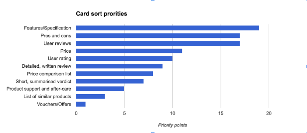
Each user took part in a card sort task, which involved them deciding the 5 most important bits of information they needed to know in order to decide whether the phone was worth purchasing or not. They also chose the 5 least useful bits of information, which enabled me to understand what wasn’t important to them.
Users were then shown the mock-up and asked a series of questions. They were also asked to point out the 5 most important bits of information that they had previously chosen in the mock-up, which very quickly identified where it lacked important information. This section was carried out using a laptop with a webcam, and I used Camtasia to get a screen recording, audio recording and recording of the user in a single video.
🏁 Summary and reporting
I grouped the responses users’ gave into:
- Positives
- Negatives
- Observations
- Recommendations
For the card sort task, I attached a score for each placement e.g. 5 points for the most important card, 1 for the 5th most important card and inverted the scoring for the least useful cards. I then totalled up the scores from every session, which resulted in a prioritised list:
Following the user testing, I made refinements to the mock-up based on the insights learned. The UI Designer in the team produced a design for the template using the mock-up that I had created.
I held a session with the development team, Tech Lead and Product Lead and UI Designer to explain the findings and show the final mock-up and design. This gave the development team an opportunity to understand users’ needs to give context to why the template would be built in such a way.
💥 Outcome
The outcome of this project was that the business gained valuable insight into user needs and a user-centered review template. By focussing on showing information that was needed by users and almost more importantly not needed, the new template had a lot less clutter than the previous iteration.
During an analytical phase which followed the delivery of the platform, engagement was maintained and increased in some sections of the site.
The biggest benefits were seen on mobile devices; the re-designed layout was much more user-friendly compared to the previous version, which used to be on a separate ‘m.techradar.com’ platform:
This project gave focus to the development team and the rest of the business. I went over and above my role to break down the template into development tasks in JIRA and wrote a spec for each task. When I discussed this with the development team after the template had been produced, it was well received and the level of detail provided became a standard for development tasks which followed.